Heroes and Villains 2007-2008
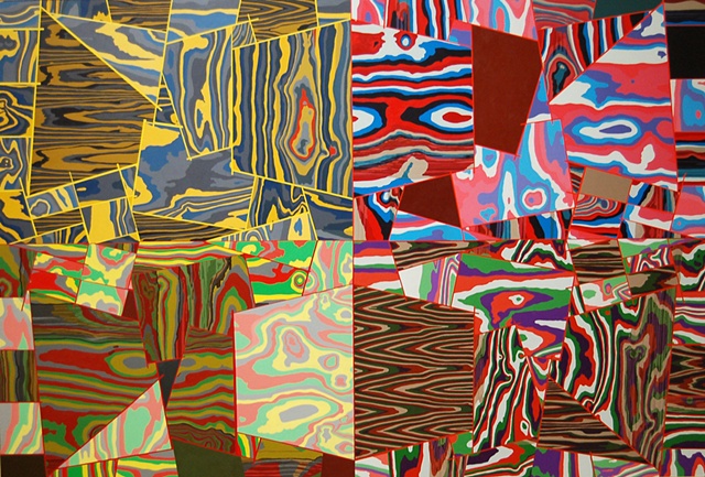
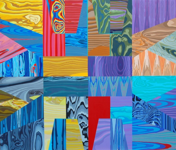
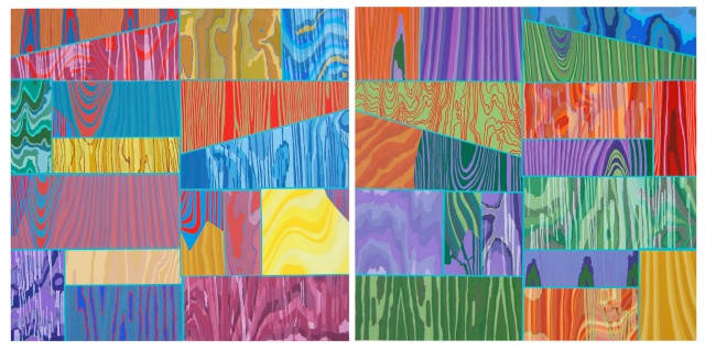
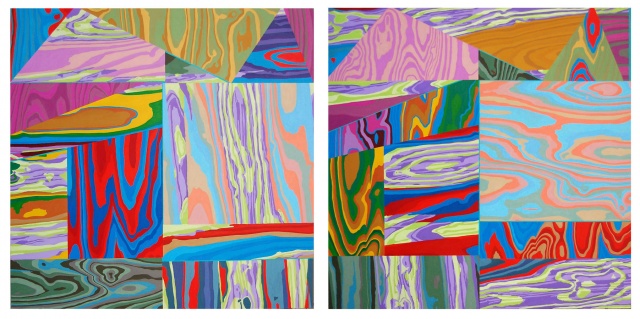
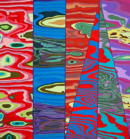
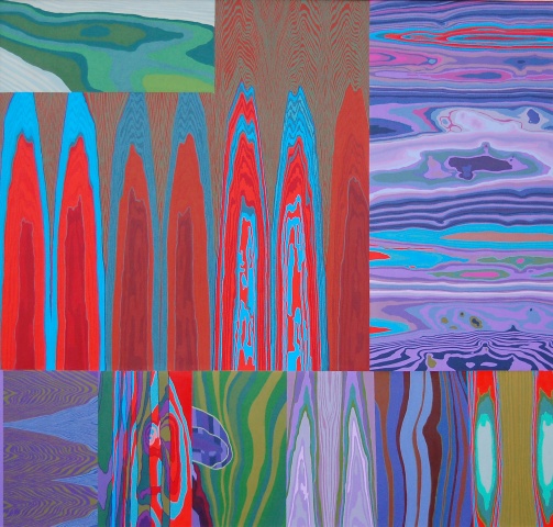
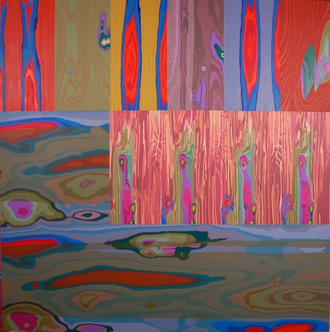
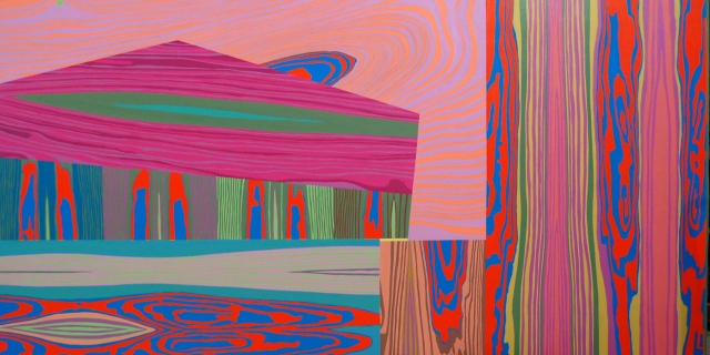
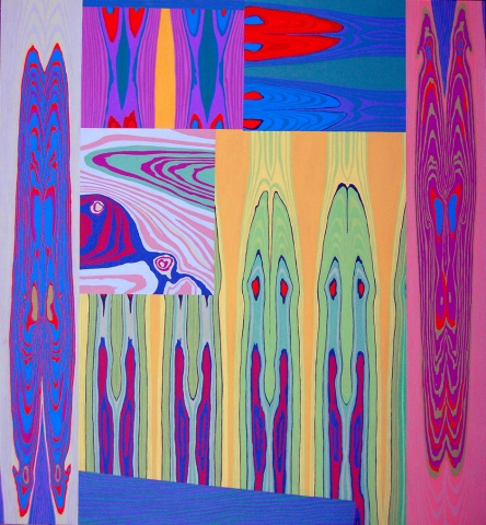
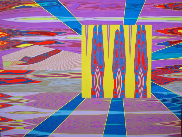
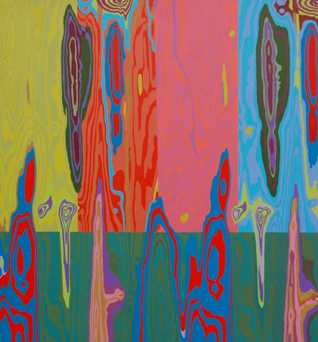
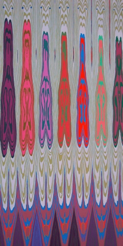
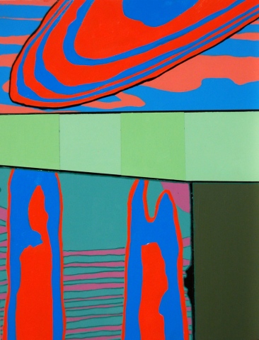
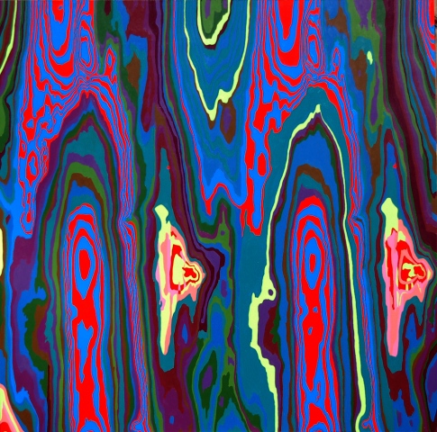
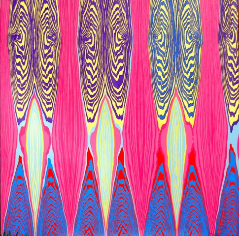
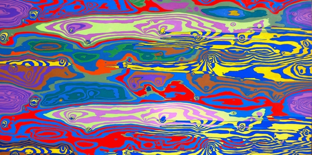
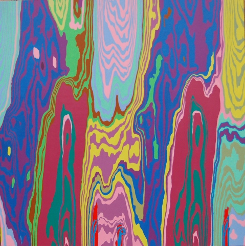
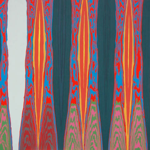
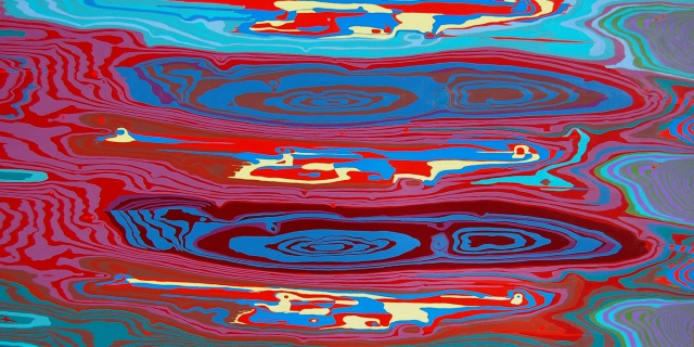
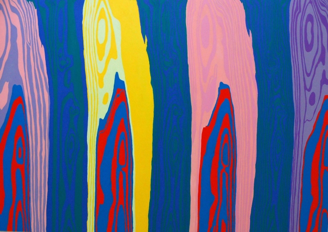
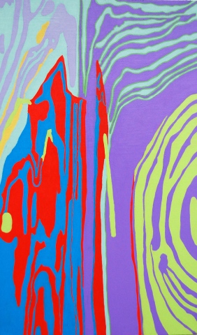
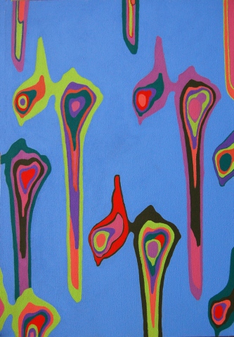
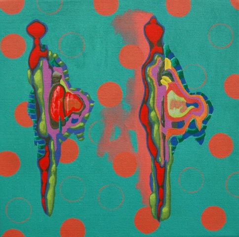
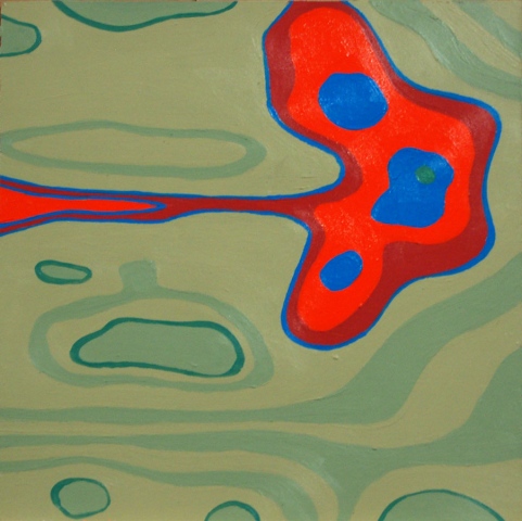

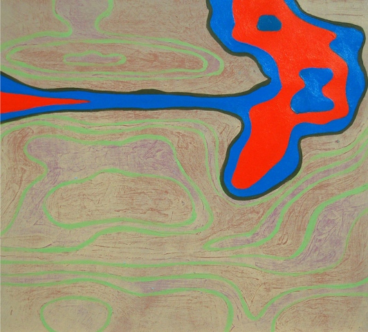
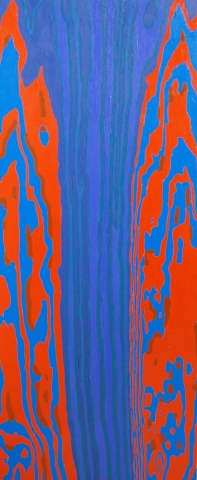
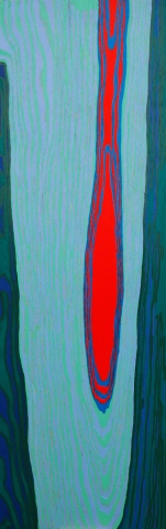
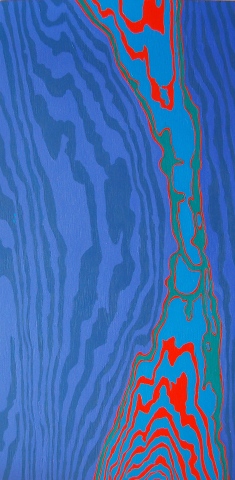
I view my paintings as a constant form of study, and I often create restrictions in one area to focus the study on another. In this series of work I work within the restrictions of birch plywood, allowing the wood grain to provide the lines and shapes of the composition. I try not to alter the pattern of the grain, but instead use color to activate and alter the perceived composition of the wood grain, by using harmonies and contrasts to minimize and accentuate particular areas. This has helped to keep the focus on color and color relationships. It has also made me more aware of the diversity of line and shape that can be found in nature, which is something I can bring into future paintings of invented compositions.
To keep the colors from becoming too predictable I have started using 1980’s Superman comic book covers as the source of my palettes. I chose the 80’s, the time of my teenage years and Military Service, because Good and Evil were still being described to us in Black and White. The Cold War was still in progress, and we had a clearly defined enemy. Comics were drawn and written in those terms as well, and the colors were saturated and vibrant. As I develop these ideas further, I plan to delve into the comics of the 1990’s and 2000’s for sources of color palettes. At that time in comics, Good and Evil becomes more nebulous, often existing in a gray area in between, and the colors become more deep and neutral.
I am also influenced by the overall composition of the comic book page, and have recently started to build my structures with multiple sheets of plywood in varying shapes and sizes, changing the direction of the grain from panel to panel. I am intrigued by how comic artists use the size and shape of each panel to depict time and space, to speed through time, or linger on a moment, and I think such a device could be interesting to use in non-objective painting.