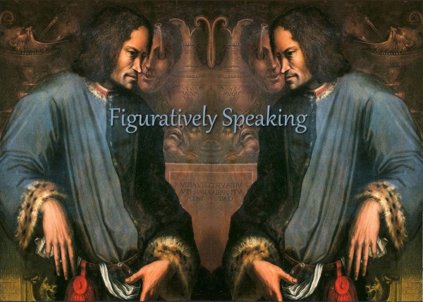
Figuratively Speaking
I have a Painting and a Drawing in this exhibition.
Dates: January 12 – February 15
Opening Reception: Friday, Jan. 19, (during Third in the Burg) from 5-8, with music by Free the Tweeds.
Prize Juror: Debbie Smith of Smith Custom Framing & Art Gallery
Synopsis: The AAH’s longest-running themed show features artwork celebrating the human form in all shapes, sizes, and media. Current members are eligible to enter up to 2 entries between 12/4 and 1/7 — details below.
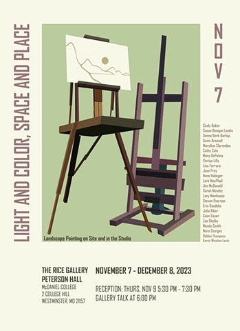
Light and Color, Space and and Place: Landscape Painting on Site and in the Studio
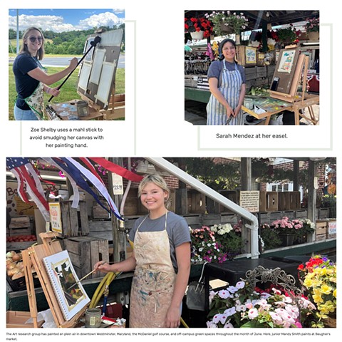
McDaniel College’s Department of Art presents “Light and Color, Space and Place: Landscape Painting on Site and in the Studio,” a group exhibition curated by Steven Pearson, runs from November 7 through December 8 in The Rice Gallery in Peterson Hall. The exhibition features 24 artists and 83 paintings. An artists’ reception will be held from 5:30 to 7:30 p.m. on November 9, with a gallery talk beginning at 6:00 p.m.
This landscape exhibition is inspired by student-faculty summer research done between Professor Steven Pearson and four students: Sarah Mendez, Lacy Newhouse, Zoe Shelby, and Mandy Smith. The exhibition looks at “place” through landscapes both real and invented, painted en plein air and in the studio. These landscapes, both rural and urban, showcase subject matter that explores common threads and unique approaches to this traditional genre will be featured.
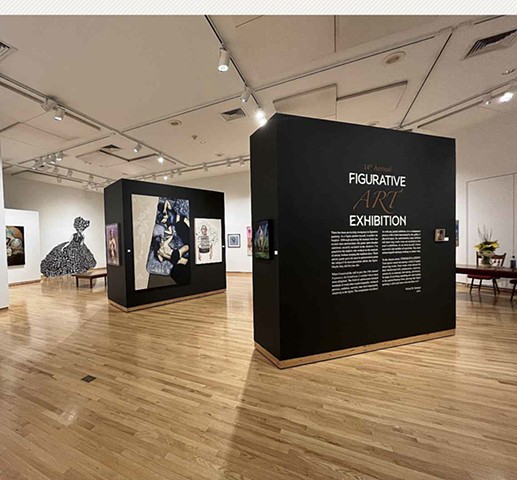
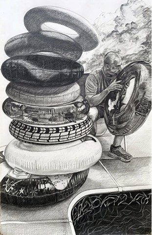
14th Annual Figurative Art Exhibition
I Have a drawing, The Move to Suburbia: Hercules' New Labors (Labor #4) in this national, juried, visual art competition and exhibition at the Lore Dagestein Gallery at Susquehanna University from )October 29th thru December 3rd. The exhibition was open to two-dimensional figurative artists (referencing the human figure), working in painting, drawing and printmaking, who are over the age of 18. This year’s juror was Nicole M. Santiago, professor of art at the College of William and Mary in Williamsburg, Va.
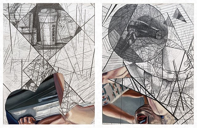
Intersections
I will have two works in the exhibition, 'Intersections', at the Artisan Alley Fine Art Gallery in Shamokin, PA from October 6-November 3rd. The exhibition was juried by Eddie Lopez.
Exhibition Statement:
An intersection is a point or line common to lines or surfaces that intersect. It is also a point at which two or more things intersect-- a crossing, a convergence, a joining.Work:
Left
Snacks, Drinks, and a Reverberating Echo, Graphite on Paper, Oil and Marker on Canvas, Collaged.Right
Hair Dryers, Diving Rings, and a Partial Echo, Graphite on Paper, Oil and Marker on Canvas, Collaged.The Art of the State
I will have a large drawing in the Art of the State at the State Museum in Harrisburg, PA from September 10- January 7.
Exhibition Statement"
The Exhibition is open to Pennsylvania artists and craftspeople, and is an annual juried exhibition held at The State Museum of Pennsylvania. With an established tradition of exhibiting highly creative art chosen by a distinguished panel of jurors, Art of the State provides an opportunity for both established and emerging Pennsylvania artists to exhibit their art and receive statewide recognition.Presented by The State Museum of Pennsylvania in association with the Pennsylvania Heritage Foundation.
Artwork:
The Move to Suburbia: Hercules' New Labors
Graphite on Paper
40" x 26"Opposites Attract
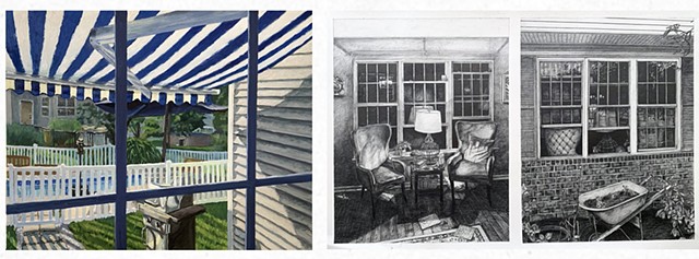
I will have two works in the exhibition, Opposites Attract at Webster Arts in Webster Groves, MO from September 12 – October 27, 2023.
Exhibition Statement:
Opposites can be exhilarating and thrilling, something completely different from what we have known our entire lives. Opposites can be terrifying, but still holding us captive in our fear. Opposites, rather than pushing us away, often seem to draw us into a story and create awe, wonder, or confusion. No matter the emotion, opposites do indeed attract.Left:
Inside/out: Bars and Barriers, Blue and White
Oil on Ampersand Clapboard
16" x 20Right:
Inside/Outside:Absence/Presence-Living Room
Graphite on Paper
26" x 40"Susquehanna Valley Plein Air Painters at Kings Gap Mansion
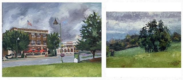
I recently joined the Susquehanna Valley Plein Air Painters and will have two plein air paintings in a group exhibition at the Kings Gap Mansion in September-October in Carlisle, PA. The exhibition is organized by the Carlisle Arts Learning Center.
Left:
Houlihan's Hershey, PA
Oil on Canvas Board
12" x 16"
2023Right:
Trees
Oil on Rives BFK
6" x 7.75"
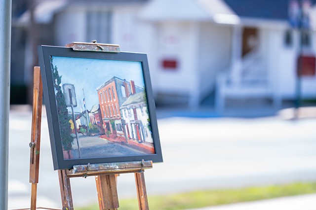
2022Selinsgrove Plein Air Competition 9/16/23
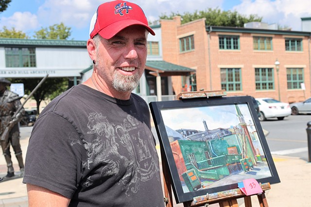
My second plein air quick draw event. This one was 2 hours and I received 3rd place. It was a fun event. I chose a view that had good light and shadow and some nice little moment of color, like the red doors on the white building.
Plein Air Chambersburg
I recently participated in my first Plein Air event, Plein Air Chambersburg. It was a 4 hour quick draw and I was awarded an Honorable Mention. I chose my composition because of the green trash cans and the green back walls of the patio against the painted brick to the left. There were a lot of strong shoes breaking up the composition as well, and the steeple on the right caught the morning light nicely.
It was also nice to do this event with one of my McDaniel summer plein air student, Zoe Shelby @zoelaineart
Plein Air painting with summer research student
I had the opportunity to do student/faculty summer research with 4 students where we attempted to get a better understanding of space, place, light, and color through plein air painting. I took a few workshops on plein air painting through Penn Studio School prior to starting the summer research, but I learned there is so much more to learn as we began to paint through the summer. I've since joined a plein air group near me, the Susquehanna Valley Plein Air Painters.
'Still', an online exhibition at Art Fluent
Exhibition Statement:
Beauty in the ordinary, in the stillness. Art is about capturing those moments that are gone again in a flash, moments that we find when we slow down. A fresh bouquet of flowers, a breathtaking sunset, a sense of joy witnessed. It's about embracing the little things, the simple pleasures that often go unnoticed in the hustle and bustle of our busy lives. So, pause, take a breath, and soak in the stillness. Let yourself be captivated by the ordinary, for it is in those moments that you will find true beauty.Check out the exhibition here Still
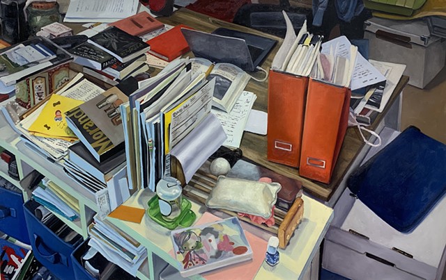
Image:
Izabel's Pandemic Desk
Oil on Paper
2023McDaniel Television Production story about the Senior Capstone Exhibition
McDaniel Television Production story by student, Steven Angel, about the Senior Capstone Exhibition.
Virtual Artist Talk for Misericordia University.
This artist talk was in relation to my work in the exhibition, Compulsory Measures at the Pauly Friedman Gallery at Misericordia University. The talk was moderated by Lalaine Little, PhD. Director of the Pauly Friedman Art Gallery.
compulsory Measures Roundtable Discussion
This is a virtual roundtable discussion about the traveling exhibition, Compulsory Measures, curated by Reni Gower. The discussion was moderated by Lalaine Little, PhD. Director of the Pauly Friedman Art Gallery at Misericordia University.
The Joan Develin Coley Chair in Creative Expression and the Arts
I was honored with an endowed chair position at McDaniel College.
Here is a Link to the story.2019 IRA G Zepp Distinguished Teaching Award
I was honored with McDaniel College's top teaching award, the Ira G. Zepp Distinguished Teacher Award.
Here is a link to the story.
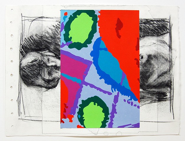
Contemporaneity: Historical Presence in Visual Culture
My work on Paper series, Sketchbook Revisions, was recently featured in the Contemporary online journal Contemporaneity: Historical Presence in Visual Culture (Volume 6). Contemporaneity is an open access journal that publishes scholarly and artistic explorations of how the complexities of being in the world have found visual form throughout time.
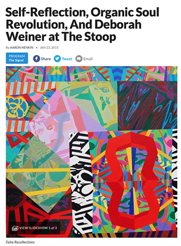
I was featured on 'The Signal' on WYPR 88.1
I was featured on The Signal by Aaron Henkin on Friday January 23rd and Saturday January 24th for my exhibition Self-Reflection at School 33 Art Center. The Signal is a regularly scheduled program (Friday's at 7pm and Saturday's at 3pm) on Baltimore's NPR station WYPR 88.1 on your dial. You can still hear the interview HERE
REVIEWS
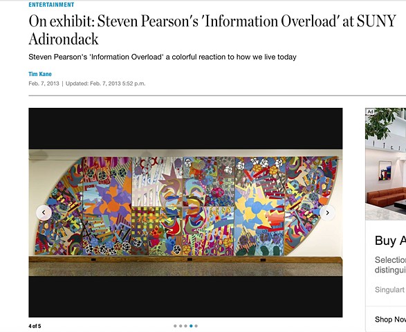
Here is an Articlee from Sunday's (2/10/13) Albany Times Union about my exhibition at SUNY Adirondack.
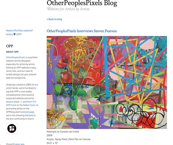
Recent Interview on OtherPeoplesPixels Blog
I was recently interviewed for the OtherPeoplesPixels Blog. I enjoyed the interview and the questions that were raised. Give it a read by clicking the above link.
“Fill in the blanks at VisArts at Rockville’s multimedia exhibit”.
Washington Post, by Mark Jenkins
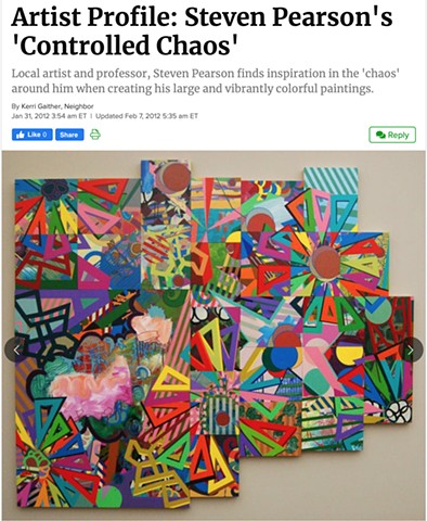
Interview in the Westminster Patch
I was recently interviewed about my work in the Westminster Patch
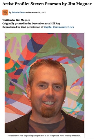
Review of "Amalgamations" in Hill Rag by Jim Magner
My recent exhibition at Studio H was reviewed in the Hill Rag by Jim Magner. The review was reprinted with permission on East City Art
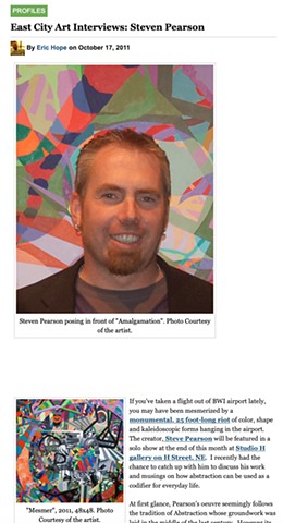
Read an interview about my exhibit at Studio H Gallery in D.C.
East City Art Interviews: Steven Pearson. East City Art
Review of "Feats of Monumentality"
"Feats of Monumentality at the BWI Airport", by Al Zaruba. Examiner.com
Excerpt from the review: "What commands the exhibition as a dazzling inferno of kaleidoscopic colors and shapes is Steven Pearson’s enormous The Whole is Greater Than(2011) At perhaps 25 feet long and eight panels, it is overwhelming up close and likely to give some serious headaches to the faint hearted. This is a warrior painting determined to lead the charge. Enormously ambitious and wonderfully balanced in its overall symmetrical shape, it nevertheless gives one ample pause to reflect upon its multi-layered implications and associations. Bite off a chunk and chew awhile. It sustains. Of all the works in the show, this is the one that presents the most arguments. Is he aimed towards the corporate? What does it say about our social network? Our economy? Is this a reflection of the American psyche? At its very center is a curious balance of form and color that seems almost benign. For all of it’s layering, there are sections that are curiously uncommitted. Perhaps the fire of other sections need breathing space. What is certain, there is far more than one can digest in one sitting. How it operates in the mind thirty minutes down the road is very different than the rest of the show. Coming back to its image unpacks new things."
review in Ode Street Tribune:
-Steven Pearson's acrylic paintings replicate with bright colors the irresistible pull of a Blackberry to the message-addicted. You can easily appreciate these works if you quickly stroll through the Arts Center. But the works that contemporary art experts Rebecca Jones and Henry Thaggert have selected for this exhibition also relate to each other in subtle ways. To fully appreciation this exhibition, see the works in relation to each other.
John James Anderson's display of D.C. fire hydrant information has formal parallels with some of Steven Pearson's work. The geometric patterning of streets in some of Anderson's panels distantly echo the networks in some of Pearson's paintings. Anderson also arranged images of individual fire hydrants into large, rectangular grids. Like in Pearson's Gaining Momentum and Daily Paintings panels, the rectangular grid pushes against the insistently individual and idiosyncratic grid elements."Works on Paper" Catalogue Statement- John Bodkin, Director
-These unique drawings combine forms and colors of the comics without the figurative transfer of images found there. The combined juxtaposition of panels and form and unlikely color and line quality in Steven’s unabashed exploration drives him into fully extending himself without regard for making his work pretty. The raw power transfers to our consciousness with an energy that can confront and question.
"New Visions" at American Contemporary Gallery-Review by Danielle Gagliardi
BMoreArt
-Within the show a few pieces stand out amongst the rest. Immediately in the foyer of the gallery hangs “Some Heroes Step Forward”, one of Steven Pearson’s bold wood grain abstractions. The combination of his use of comic book colors and the overwhelming scale of his pieces gives the impression of complexity and simplicity at once."New Visions" Catalogue Statement- John Bodkin, Director.
-While many artists fall into a comfort zone in their work, Steven is absolutely fearless and driven in his exploration as an artist. The work exhibited here is bold, vivid in its color range and unrelenting in its forms. Steven attacks the very essence of a definitive world. Good and evil, black and white, night and day, real and fantasy all become part of his aesthetics and encompass even his material and techniques.
"Naked" exhibit exposes abstract views of life
by Glenn Mcnatt, Art Critic, Baltimore Sun. Wednesday 7/19,2006 pp1E & 4E-Steven Pearson, who has the largest number of works in the show, is also an abstract painter, but his method often involves a whimsical reiteration of familiar figurative forms until their original character is no longer recognizable. In these colorful, carefully organized canvases, one senses a world of identifiable shapes that seems to lie just beyond the ken of normal perception, but nonetheless remains vitally alive and cogent.
Still Liquid/Still Solid
By Pam Zappardino, Art Critic, Carroll County Times Friday, June 02, 2006-Steven Pearson uses color and form to build tension so tight you can feel it. Organic shapes strain against geometrics, complementary colors bleeding into shades of similar hues. "Copulating" is constrained by its frame while fitting perfectly within it.